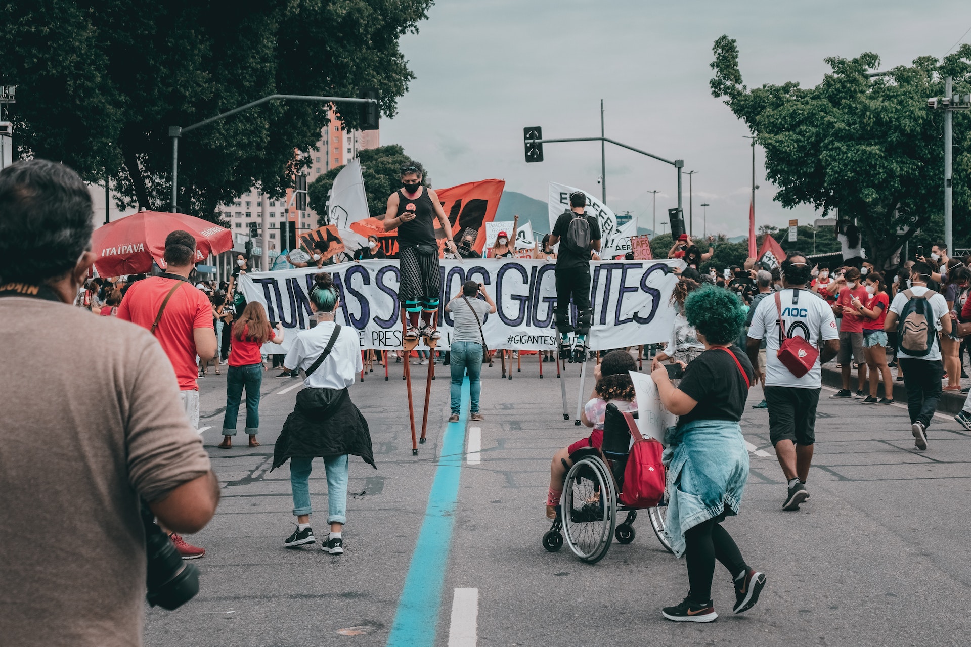
Barricade Covers are important marketing mediums for establishing your brand. Additionally, barricades are important in managing crowds during an event. The design of your barricade plays an important factor in getting people’s attention. In this blog, we will tackle important design tips to help you capture people’s interests and manage them accordingly.
What are barricade covers?
Barricade covers are usually made out of durable mesh polyester and polyester material. When it comes to design, you have the freedom to create whatever design is preferred. These designs are digitally printed out on either side or both sides of the cover. The finishing could either be with eyelets or velcro. In addition, the size of these covers can also be customized. Barricade covers are popular with marketers and sponsors as they are weather-resistant and perfect for outdoor events. This is the reason this marketing medium is used for event management and crowd control. Another reason why this is preferred is that it's easy to assemble and disassemble. These covers don't require much human resources. It also requires low maintenance when it comes up. Plus they are easy to clean. You can wipe off the dirt or wash them with warm water and gentle soap to remove any debris.
Design tips for crowd control
Visibility is the key
If you are going to use barricade covers to communicate with your participants, the messaging should be visible and easy to read. Let’s say that you are organizing a marathon. The expected participants are around 500 people. During the event, it should be clear to them where the participants should be located and where the audience should stay. Use the design for messages such as ‘Participants - Right Wing’ Audience - Left Wing. These covers are also used during the event proper as instructional tools. The design should be visible enough that although they are running or walking, they can still see the message. For example,’ right turn - 500 meters away.’ This keeps the participants on track. They can prepare mentally as they continue with the event. At the same time, the audience is also kept informed and would know how to stay in their lane.
Font size is critical
If your design’s font is too small, people won’t look at it. Any warnings communicated in your covers will be overlooked. Make sure that the fonts are large enough for people to see at a certain proximity. You also have to factor in the type of audience you are communicating with. If your event is attended mostly by senior citizens, you would need to adjust the sizing. The majority of them probably have challenges with their eyesight given their age. On the other hand, do not make it too big that it might seem like you’re forcing your messages to your audience. It can get overwhelming seeing covers with too large font sizes. It seemed like the brand or the event organizers were shouting at you. To make sure which font size is reasonable given how large the event place is, consider doing some test print. You may also get people’s opinions from these test prints. After Which you make adjustments in your design accordingly.
Font type is a factor
In connection with the font size, the font type is also an important factor. Let’s say that you want to warn people of the roadblock. Imagine using fonts such as Bleeding Cowboys, Jokerman, Neuland-inline, or Papyrus. Chances are you won't be able to control people and they end up heading towards the roadblock. In choosing your font’s design, make sure that it’s easy on the eyes. You can use fonts such as Bodoni, Garamon, Helvetica, or Futura. According to designers, when choosing the right font there are several factors to consider. This includes balance, legibility, consistency, and kerning. An example of a balanced font is Bodoni whilst Garamond is high for legibility. Look out for imbalanced fonts as they are aesthetically unpleasant on the eyes.
Simple Messaging is sticky
As they say, the more simple the messaging is the clearer it is for the audience. Going back to the marathon event. Simple messages such as “Caution! Race in Progress” are easier to understand than “Please be careful when driving, there is an ongoing race sponsored by X brand with about 500 participants. Make sure to watch out for them.” Which one do you think is better? The first option is much better than the latter. It is simple, short, and straight to the point. Remember that during a marathon there are several other factors that both the audience and participants should focus their attention on. This is why keeping your message clear and sticky is essential in managing people.
Design tips for branding
Barricade covers are perfect marketing collaterals to display your brands or your sponsor’s brands. Think of them as billboards displaying your logos or products during the event. The only difference is that, unlike billboards, these covers are only displayed until the event lasts. After the marathon is over, they will be removed from the event place. Billboards, on the other hand, have specific contracts in terms of their placement duration at a particular location. When designing for a barricade cove, consider the following design tips.
Stay consistent with the branding
Barricades are used mainly for outside events. This means that you have the opportunity to capture not just your target market but also other people. This is your chance to widen your scope of the market. There may be people just passing by and would see your design and get interested. They might not be part of the event or your target market. But because your design is interesting, you can capture them and convert them into a buying market. Branding consistency is important because your already established market could easily recognize your brand. This supports loyalty to your brand. And at the same time, your brand is introduced to new types of target markets.
Do not neglect your sponsors
If your event is run by numerous sponsors make sure that all of them are accounted for in your design. Do a quality check especially if you have a handful of sponsors to place in your cover design. Imagine missing out on even just one of your minor sponsors. This could equate to negative publicity for your event. In addition, this will hurt the relationship you have built with your sponsors. Another thing to consider is the equality of your sponsors' brand logos. Make sure that the sizing is even. If there are logos that are bigger than the others although they have the sponsored amount, you can end up reprinting all your covers. This could also put some bad blood between sponsors. Test and iterate your designs to make sure that you are not overlooking other details before the final print. Get someone from your team to have a look at the art design with fresh eyes. This helps identify some details that need to be adjusted in the design’s overall look.
Incorporate Interactive elements
These days people rely a lot on technology. Make sure that your design is engaging to capture people's attention so that they end up posting it online. You can add a QR code that can redirect to certain promos or discounts of the events. Be creative with the use of hashtags to help you better promote the event online. Collaborate with some professional graphic artists to help you come up with a design. You want something that people would want to take selfies with and get as much user-generated content. This way you won’t be spending too much on your marketing campaigns.
Enhance your brand’s visibility through the use of barricade covers. This is an economical way to endorse your brand and at the same time manage your event’s participants. The safety of everyone is important, that's why crowd control should be prioritized. At the same time, make sure that your branding stays on point.


