If you are walking down a busy street, notice which display catches your attention and why. These days, we live such a hectic lifestyle. Different things are fighting off to capture our attention. As a marketer, learning how to make your advertising flag design stand out is critical to attaining business success. Displays with clear messaging, powerful designs, and striking colors can get the attention of passersby. Learn the different tips and tricks on how to outshine your competitors with your striking designs.
1. Determine Your Purpose & The Audience
Before actually starting your design. You need to identify first your purpose. What is the goal of the goal? The ones listed below are just a few of the common marketing goals.
- Brand recognition
- Product promotion
- Increased engagement
- Sales Conversion
- Rebranding
- Better brand recognition
- Announcement of upcoming events
- Awareness campaign
- New business launch
Apart from knowing the purpose of the campaign. You also need to determine the intended audience of these advertising flags. You need to align the design and messaging of these banners based on the intended audience you wish to capture. Your audience could be any of the following.
- Students
- Parents
- Professionals
- Community
- Young kids and teens
- Religious members
- Fans
2. Identify the venue where it is going to be displayed
You need to determine the place where the banner and to be hanged or installed. Know whether it will be an indoor or outdoor event. This will help you decide on which colors to include in your design. Taking time to ocular the place or at least having an idea of what the place looks like is important. As a designer, you will have to consider if there are plenty of other things around that are competing for your customer’s attention. The goal is to have them focus solely on your branding efforts and nothing else. If the back display will be used as a backdrop, having an idea of how much foot traffic is there or how crowded the place could get is also integral. This will allow you to make the necessary adjustments to your design elements.
3. Decide on the color to be used
You don’t want to be using dark colors for an event at night. If the advertising flags are to be placed in an area with dim lights, having monochrome colors in your design won’t be helpful. In an article posted on LinkedIn entitled ‘8 Tips for Effective Banner Design to Run Your Marketing Campaign,’ the author mentioned that it only takes about 90 seconds for individuals to formulate their opinions about people and products. And in between that 90 seconds, they can formulate an opinion based on color alone. So yes, choosing the right color for your design should be prioritized if you want people to have a positive opinion of your brand.
4. Font Style and Font Style matters
The advertising flags should communicate the message to the audience across the distance. One common mistake that business owners make is wanting to get the most out of their expense from ordering advertising flags so they bombard the design with text. Remember there should be a balance between the text and other visuals. Let’s say you are using feather flags, if it gets too text heavy the designer is likely to reduce the font size making it smaller and smaller to accommodate all the details. Your audience will not take time to read displays with text that is too small or if it's too text heavy.
One thing you can do is run a test print to check the viewing distance of your design. You can do this if you have some more budget to spare. If none, keep in mind the readability of your text from an expected viewing distance. This will ensure that your messaging gets to be communicated effectively to your target audience.
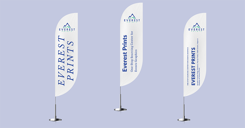
In addition, the font style also matters. Let’s say you have a teardrop flag that you wanted to display on a school ground. Since your audience is students, you should be using fonts that are easy to read yet it appeals to younger audiences. If you are using script fonts, make sure that people are still able to read what’s on there. Just take a look at the image below, you can tell right away, which messaging can easily be understood.

5. Be concise with your messaging
People only have seconds to absorb what you want to communicate so be concise with your messaging. Long texts are highly to be ignored especially during rush hours or in a heavily crowded space. Keep the wording simple and brief so that people can understand and absorb it in seconds.
6. Make sure to use high-quality printing
One thing that can ruin your design no matter how good it looks is a low-quality print. This could destroy the overall aesthetic appeal of your advertising flags. Make sure to connect with credible printing shops for advertising flags to get the best out of your design.
Always make sure to save a backup copy of your design. There could be several reasons why your file could get corrupted. To save you the headache of having to redo everything again, make sure to always save a backup copy of your design. It will save you time, energy, and resources. If you are saving it into your hard drive, make sure that it is password protected. You don’t want anyone using your creative assets elsewhere.
7. Run a Test
If you still have the time and the budget for a print test, do so. It ensures the quality of your advertising flags once you give the green light for the batch print. The prototype print will help you evaluate if the text size is enough in consideration of the viewing distance. In addition, this will allow you to ask passersby for some insights and feedback. You can then use their recommendation to make the necessary adjustments to your design. Furthermore, taking the time to do a test allows you to check the lighting conditions and other external factors surrounding the flags. You can do your observation and make changes you deem necessary to make the flag stand out better.
8. Make your design interesting
You can have a simple design and straightforward messaging yet still make that impact. Play with different elements to make your design more interesting. You can also use gradients, shadows, and lines to add more elements to your design. You can have a 3D effect or make it seem like it's moving once the wind hits the flag. Be creative with the design and avoid using templated ones if you truly want to stand out from the crowd.
9. Do not forget your brand element
Logos, taglines, brand colors, and other design elements are important for recognition and recollection. Your target audience will become more aware of your brand, products, or services if you are consistent in applying your brand design to your advertising campaigns. Think about seeing an advertising flag with images of lipstick and mascara, without proper branding, you would not know what company sells them. Consistency is one of the keys to brand awareness and brand recall.
10. Use high-resolution images
The reason for using high-quality images is to have sharp images on your design once it gets printed. If you use low-resolution images in your design, once it gets printed it can look blurry. People won't be interested in looking at designs with blurry images. Your customers could also assume that your advertising flag has already faded out because of the quality of images in the design. This could hurt your brand image. So make sure that you are only using elements that are of top quality.
There are plenty of factors to consider when designing your advertising flag. This demands planning before the actual design takes place. But, if you can consider the factors listed above you are in for an impactful advertising flag. Be mindful not just of the colors you are going to use but also of other elements that go with the design. All the elements should seamlessly jive together creating a captivating visual worth looking at.
Test your design if you can. Consider the viewing distance and create a unique design that people will be talking about. Stretch your creativity. Make sure that your advertisement stands out from the crowd and creates a lasting positive impression on your audience. Remember that the design is important in communicating with your customers.
